Context & Constraints — The deadline crept on us.
There was a plan to turn an outdated data market, planned and designed for internal usage, into a new one with easy customer access, open for various providers — and it needed to be up and running in a year. The roadmap was tight as the plan was just to adjust an up-and-running API platform, but as the business requirements were pouring in it was slowly dawning on the team: "this will not be doable." We'd need a new platform that merges the API and data marketplace, built from the ground up.
4 months before deadline, there was a sudden realisation. We have no way to admin that platform. The business requirements for that part were vague, the ops team weren't quite informed this was happening, and didn't know they needed to provide requirements. The notion was it'll be a quick and easy task.
Then the floodgate was opened with business requirements from ops. The complexity was just building on itself. I was tasked to do the design for it in 2 weeks. It went longer than that, but you'll see why.
Research — Large, friendly letters: do not panic
Beside business requirements and access to the functioning web app we had nothing. No data was collected. Usage, painpoints, flows were not accessible via data. Next best thing: remote contextual inquiry. As the team was a couple hundred km from me, I ran video calls to observe how they work, what they actually use, and how — watching over screenshare, asking questions as they went.
The info gathered was a bit shocking. The old app was built by engineers, with no plans to make it user-friendly, and zero automation in mind. All manual. The lifecycle naming was confusing. Functions were dangerous — re-activating a deleted/canceled/refused order was one misclick away. Fine while internal, but not once we open expensive data to the public. Some functions needed the operator to go back and forth across pages, copy-paste data to notepad, then fill in forms. This wasn't fixing friction anymore — it was redesigning the whole flow to be more secure and easier to use.
Stakeholder Requirements — No time to push, we're making it more complex…
Some parts needed to stay manual. Some for understandable reasons. We're selling trading data with geo limitations — we need to double-triple check who can access it. VPNs exist, company info can be faked, but a legit email is harder to spoof. We can fast-track when we have that, but until then some security processes stay.
Some for reasons not fathomable. Sales insisted subscriptions be completely manual. A user can request a subscription, but it isn't just a manual check — it's manually set up. No automation. Not even prolongation of an existing subscription.
We didn't want to build the app only to rebuild it in 6 months. So: "make it manual" but as easy as possible to make automatic later (with security checks). Tech limits using 3rd-party Auth meant we couldn't check users at signup. So — complex it is.
Technical Constraints — Actually we need to cut down on complexity
I was working with the tech lead, who was slowly transitioning to product owner and unfortunately PM too — poor guy was stretched across three roles. For the first draft: do the ideal flow in wireframes. And then "we'll see."
"We'll see" equalled: "it's excellent UX, but we can't nest screens, so functions need to open in a new tab. And reuse as many existing elements as possible." That meant thinking like a sys admin, fighting for some functions while I could, and letting go the ones that technically couldn't be done in 2 months.
The requirements were written per design, so I worked as free as I could inside limits that sometimes felt like a straightjacket. But seniority also comes with knowledge. If there's no product, if it's cut, there's nothing to improve. Cursing in languages no one understands was the price to pay — but the job got done.
Design Solution — Important, even if you are easily bored
I'll focus on the requirements, because without them the screenshots make no sense. This is maybe a 1/5th of all screens produced in that timeline, and I'll focus only on the orders happy path.
Orders can have different states:
There are in-between states when the order is waiting on input from ops. This is where they work the most, so it's grouped into one tab: action required — awaiting confirmation and processing.
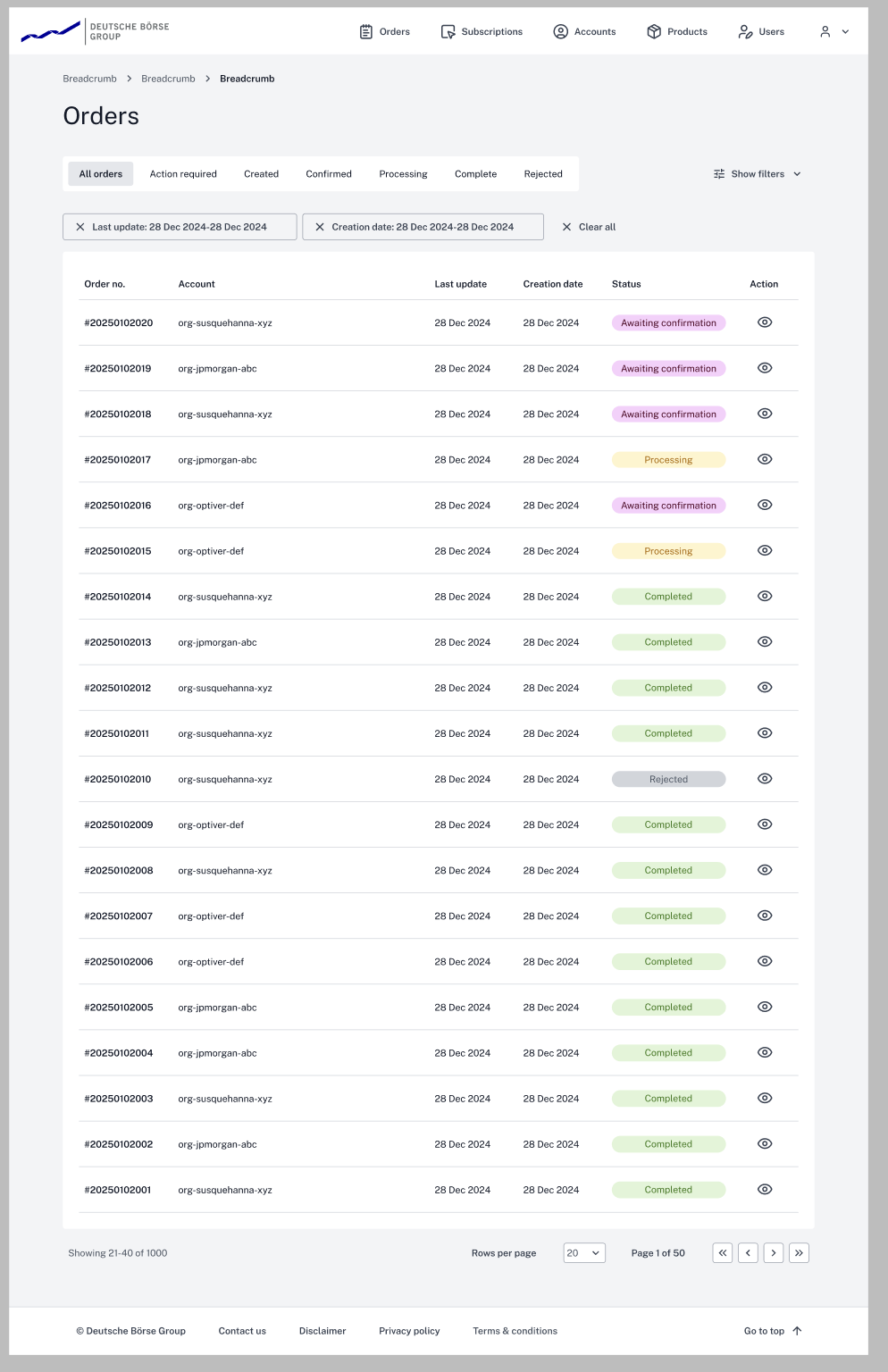
Order happy path
User makes an order. It's created and goes immediately to action required — awaiting confirmation. All orders need confirming (fast-tracking rules cut due to time limit). The operator opens the order, verifies the account if needed, and checks if it's paid (orders above €9,500 are bank-transfer only).
1. No manual entitlements
The operator sees this screen and the button states "confirm order and finish" — making it clear that confirming here and now is the last step for this order. After this it's confirmed and the user can use the products.
The information hierarchy is based on ops input: what they verify first at the top, product/pricing details at the bottom.
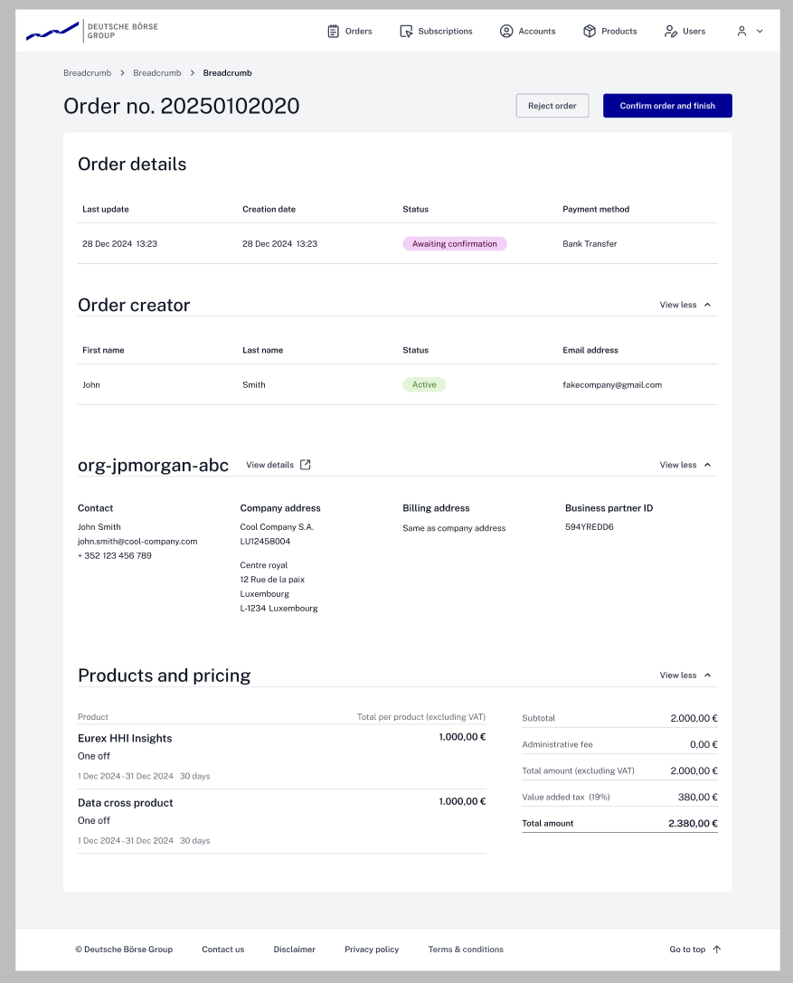
The order creator needs a verified email — if it doesn't match the company, red flag. Users can enter any company name, so we check they're actually part of that company on record. Separate sections make comparison easier.
They don't impact confirmation at all — security measures trigger before the order is made, not here.
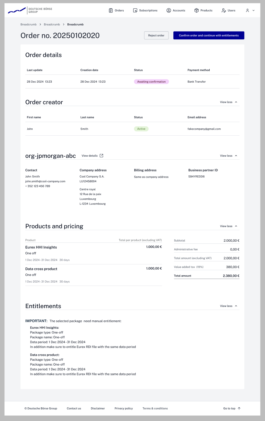
2. Manual entitlements
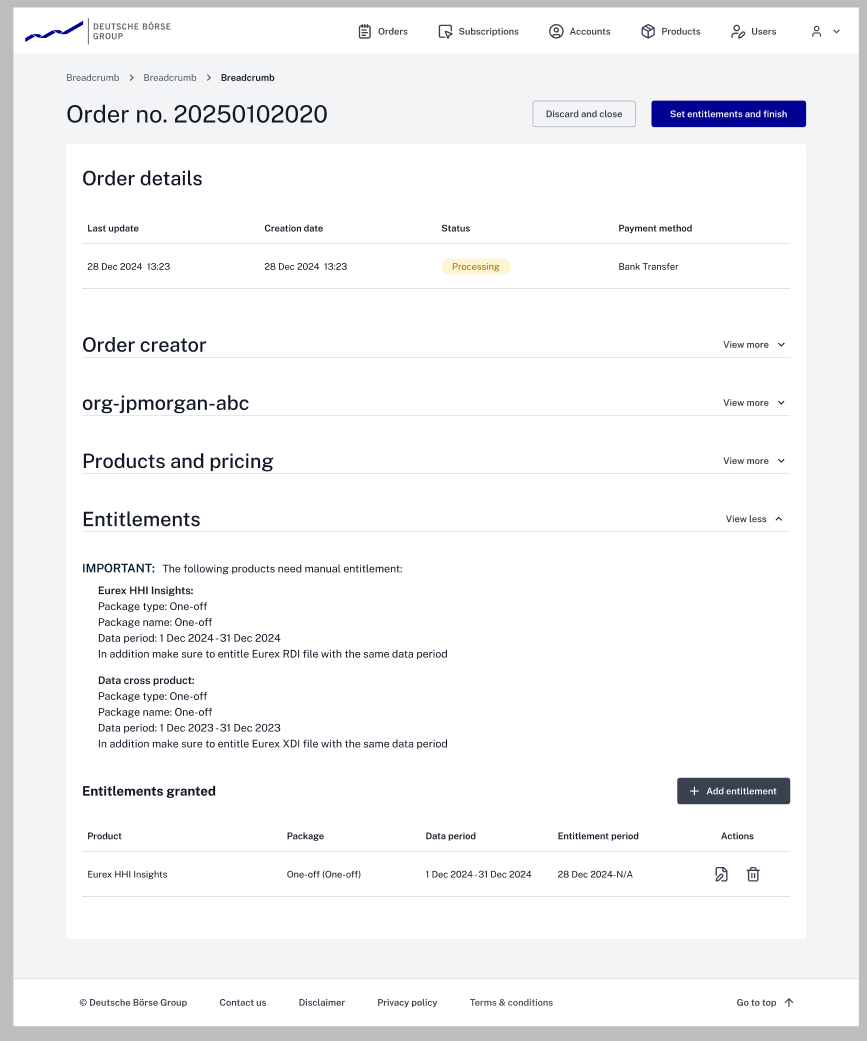
Here the button states "Confirm order and continue with entitlements" — informing the operator there are more steps, this isn't the last one. Hierarchy is again focused on confirmation; the rest is present but less important.
It conveyed the message clearly and didn't confuse ops — other options we tested did.
On confirm, the operator moves to the next screen. Tech limits come into play: it needed to stay as similar as possible to the previous screen. This is less frequent (<5% of orders) and we had no time for special screens. The top button states "set entitlements and finish."
That info isn't needed for this action. But due to tech limits, if the operator wants to check something it's still accessible.
The entitlements-granted section opens where the operator adds entitlements, in a separate screen that changes depending on the entitlement.
Tech constraint. Embedding would require redoing frontend code across all pages. A separate screen reuses the same code called from different points — entitlements are also used in subscriptions.
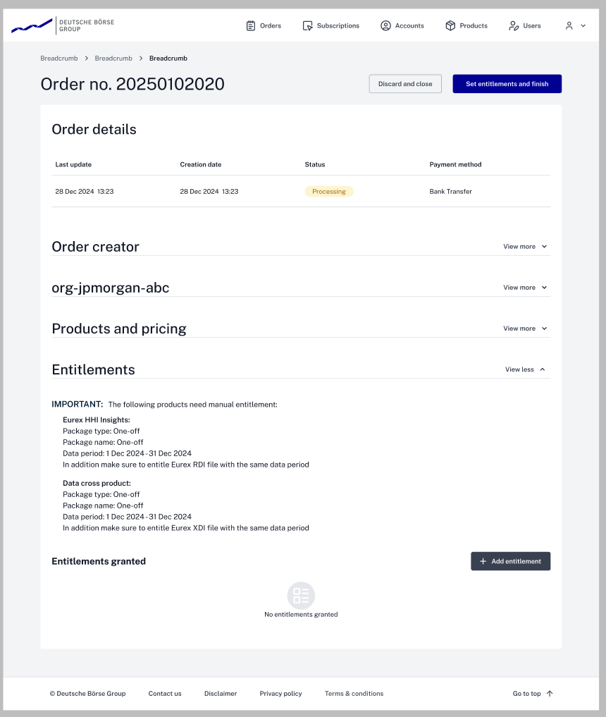
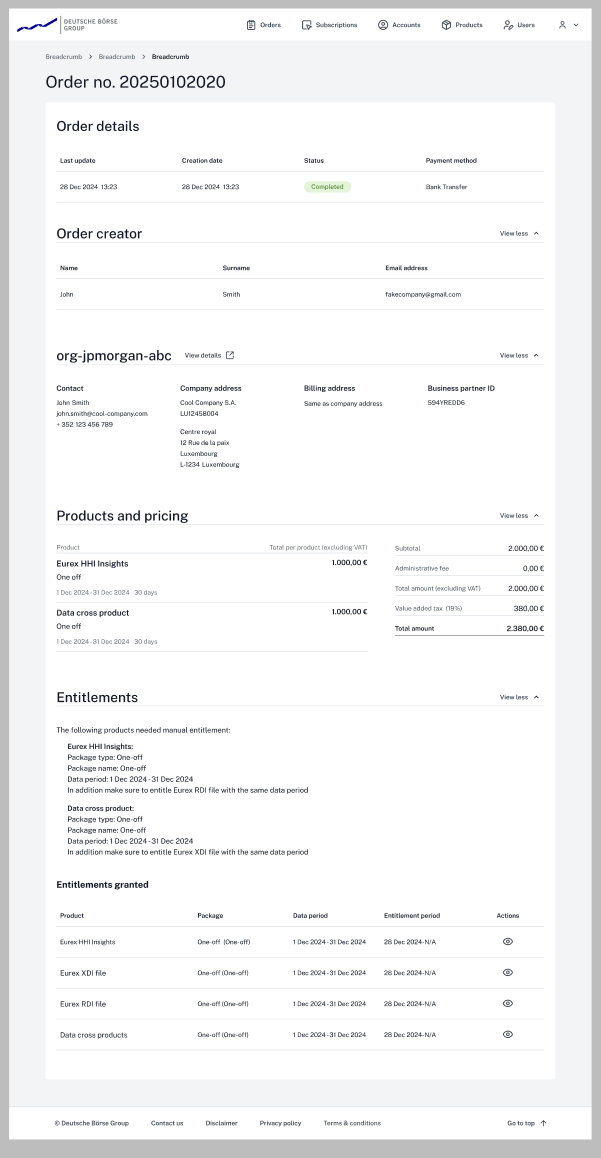
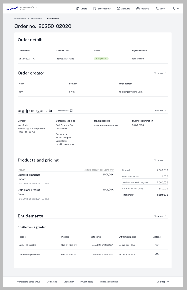
Once an order is created, ops can always open a "ledger" of what was ordered. Entitlements aren't linked to this ledger — again, time and tech limits.
Results & Impact — Why is this better
You never showed us the original. I hear you.
The lifecycle flow is now one way — no accidental "revival" of canceled orders, streamlined from 10 confusing states to 5 clear ones.
Entitlements are now per company. A 50-person order went from 50 manual actions to one. The operator only approves once.
All user and company details are in one place. Before, they were in separate spaces — the operator checked two places to confirm legitimacy.
Cut the average time to confirm an order. All because we listened. There are ideas to improve this further.
Plus the option to link a business ID and verify an account from the order — not possible before.
Reflection — All stories end, even boring ones like this
Even with strict time limits, not listening to users wasn't an option. Because we did, we saw the pains of their process and had the chance to make their life easier — sacrificing something along the way, but with a clear vision of what we needed to make it work and then improve.
What would I do differently?
A lot — but hindsight is 20/20. The task was on the roadmap, but its importance wasn't clearly communicated. One thing I'd skip is the "design the best flow" phase; knowing how much was cut, it was a waste of time. Also the wireframing for stakeholders — lost 3 days for nothing. We had a good design system and building blocks; in those 3 days I could've done near-pixel-perfect designs and fixed them later.
What did this project teach me?
Stress management became a skill. Jokes aside: patience. I knew perfect design doesn't exist, but this deepened it — and made "foxhole friends" of teammates.
Going forward?
I know how to handle impossible deadlines — when to push for a feature, when to "lose" one, and how to ask for help.