Token-First Design System Exploration
This project is a self-initiated case study based on Good Maven's existing website. Rather than presenting work under NDA or fabricating a fictional brand, I chose to analyze a real product and propose a scalable design system foundation as a demonstration of how I approach systems thinking.
The system was intentionally limited in scope to focus on structure, semantic clarity, and future extensibility — not visual exhaustiveness. Rather than building a complete component library, the goal was to establish the architectural decisions that make a design system actually scalable: naming conventions, token hierarchy, and the relationship between primitives and semantics.
This is not a critique of the current site — it's an exploration of how I would approach foundational systems work for a growing product.
Three things this system had to do.
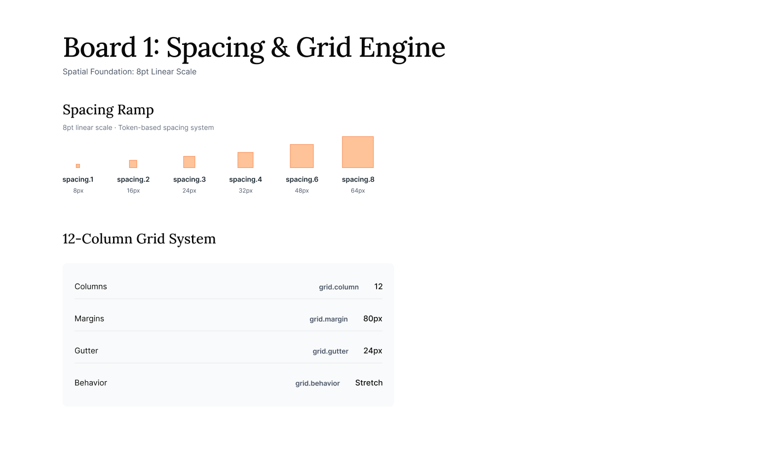
Spacing & Radius
Spacing follows an 8pt-based scale to ensure rhythm and predictability across layouts. Border radius tokens are intentionally constrained — not every component needs five radius options.
Restraint here isn't a limitation. It's a design decision that reduces cognitive load for both designers and engineers, and keeps the UI feeling cohesive as it grows.
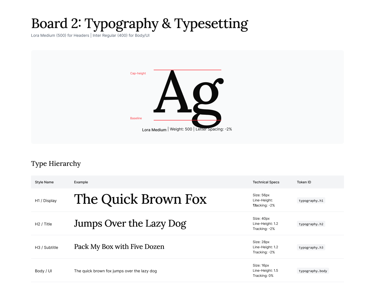
Typography
The type system balances editorial clarity with UI readability. A deliberately limited scale reduces inconsistency across surfaces while remaining responsive-friendly.
Type tokens reference size, weight, and line-height as a single unit — preventing the mix-and-match styling that slowly erodes visual cohesion over time.
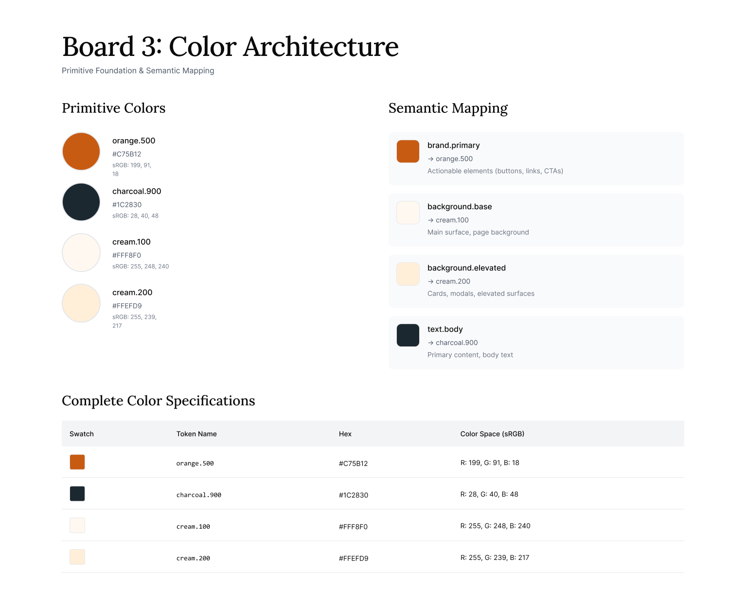
Color System
Primitive colors are defined on numeric ramps (50–900) to allow future expansion without breaking existing references. Semantic tokens abstract intent — text, background, border, interactive states — from raw values, enabling safe evolution of the palette over time.
This separation means a brand refresh, dark mode, or new product vertical wouldn't require touching individual components. You change the semantic mapping once; everything downstream updates.
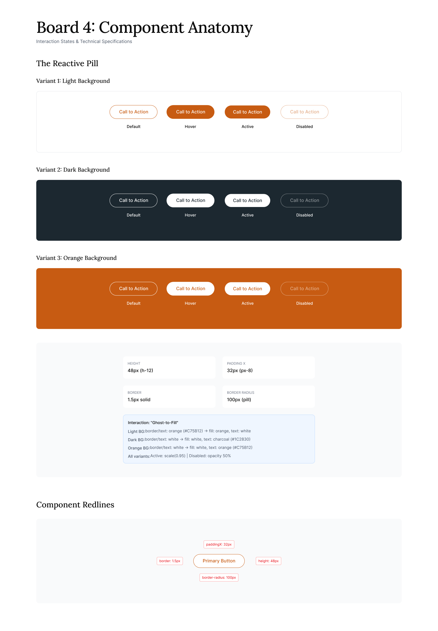
Buttons — Why buttons first?
The system currently includes primary, secondary, and inverse button variants — each with default, hover, and disabled states.
Buttons were selected as the initial component due to their frequency, state complexity, and cross-platform relevance. They touch every layer of the system — color, typography, spacing, radius, and interaction states — making them an ideal stress test for the token architecture.
If the tokens work for buttons, they work for everything.
Additional components would layer on top of this same foundation as product needs evolve. The system doesn't need 40 components to prove it works; it needs one component that proves the structure works.
Scalability isn't achieved by building more.
Scalability isn't achieved by building more — it's achieved by structuring well. This system can grow in two directions:
Extend primitive ramps (new colors, spacing values, type sizes) without touching existing components.
Introduce additional semantic layers (dark mode, high-contrast themes, sub-brand variations) without breaking what's already built.
Tokens follow W3C Design Tokens conventions, allowing direct engineering consumption via tools like Style Dictionary or Tokens Studio. This isn't a Figma-only system — it's built for real handoff, real codebases, and real collaboration between design and engineering.
The goal isn't a pretty Figma file. It's a shared language that both disciplines can trust.
How a System Like This Evolves
With a foundation in place, natural next steps would typically include:
The point of this exploration wasn't to build a complete system — it was to demonstrate how I think through foundational decisions, prioritize scope, and structure work that others can build on.
If you'd like to discuss this work or how I approach systems thinking, I'd love to connect.